Website feedback - tell us how to make it better

I like how clean and easy the site is to navigate, which makes finding discussions much smoother. One suggestion would be to make certain resource pages easier to access directly from the homepage. For example, when businesses are searching for tools like POS system solutions, having a clear and dedicated section for related resources could really add value. Overall, the forum layout feels friendly and straightforward.

Oh the irony. Another scammer reported.
 
Since this ancient thread has been revived now, here are my thoughts:
  • Deactive 2FA for the forum. It's too much friction to protect something insignificant. Yes, it makes the accounts a little more secure but it's a low stakes forum without any payment data or PII stored in our accounts. Plus anyone can sign up for it, so nobody has much reason to hijack accounts. Plus, 2FA is not a silver bullet for account takeover anyway. If someone with technical expertise really wants to, they can still do it.

  • Keep religion out of the forum, the website and the conversation. It has nothing to do with morality or ethics.

I think deactivating 2FA would be counter productive in view of all the scam posts I have just reported. The danger is that more vulnerable users of this forum may click on links that damage them.

I do think we need to make it harder to sign up in the first place so that accounts can be vetted before they are activated. That might help.

Totally agree with you on the religion aspect though.
 
I would like to have a dark themed option. I'm not sure how easy or viable that is. I reduce the screen brightness but just prefer reading in light on dark.
 
I would consider myself very tech literate, and I am finding this website a nightmare to navigate. One of the previous comments on this post listed multiple points about the website that are making it exceptionally difficult to navigate, and it's from 4 years ago, I'm finding myself come across the same issues as they were. It sounds like the website needs a total refresh from the bottom up, there's dead links and formatting issues, there's the forum log in then under any pages with ndsa.uk/toolup/ as the start, they've got a different log in. I'm hoping to take part in the mentoring programme coming up, but I'm really worried that if I'm struggling with the site being clunky and hard to navigate, will that even be possible?
 
I would consider myself very tech literate, and I am finding this website a nightmare to navigate. One of the previous comments on this post listed multiple points about the website that are making it exceptionally difficult to navigate, and it's from 4 years ago, I'm finding myself come across the same issues as they were. It sounds like the website needs a total refresh from the bottom up, there's dead links and formatting issues, there's the forum log in then under any pages with ndsa.uk/toolup/ as the start, they've got a different log in. I'm hoping to take part in the mentoring programme coming up, but I'm really worried that if I'm struggling with the site being clunky and hard to navigate, will that even be possible?
Hi Abbie - I think NDSA are aware and something they want to fix - which hopefully will help reduce the spam in the forum too
 
Personally I find having accurate, up-to-date information on the main website more important than the look of the forum. Yes it's not great but even with a black theme, using a screen on super high brightness isn't good on your eyes (unless in really bright sunlight)
 
I would like to have a dark themed option. I'm not sure how easy or viable that is. I reduce the screen brightness but just prefer reading in light on dark.
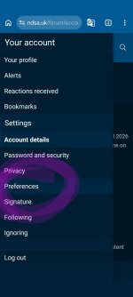
@Joeys you can change to dark blue

  • Click on your profile
  • Click on your account
  • Click on preferences
  • Click on style and choose ultimate blue and it will change to dark blue
See screenshot attached
 

Attachments

  • Screenshot_20260414-185055.Moto App Launcher~3.jpg
    Screenshot_20260414-185055.Moto App Launcher~3.jpg
    61.8 KB · Views: 0
  • Screenshot_20260414-185048.Moto App Launcher~2.jpg
    Screenshot_20260414-185048.Moto App Launcher~2.jpg
    152.7 KB · Views: 0
  • Screenshot_20260414-185224.Moto App Launcher~2.jpg
    Screenshot_20260414-185224.Moto App Launcher~2.jpg
    76.8 KB · Views: 0
Hi @Rose @Margot

I used the website now for two months and I have some feedback

First impressions

It's very clutter and to many options most of which don't do anything

Changes I would make to the menu , which is decision and visually demanding
  • Under forum remove all options other than latest activity, nothing else is needed, it's just visual clutter and gives to much choice you don't actually know what to click
  • The help menu, there is so much choice in there, and I click help thinking I'm going to see a FAQ or link to send an email, maybe list of crisis numbers: I would remove everything else, it's confusing and not what you would expect to see under a help menu
  • Advocacy - I would expect to see link to what advocacy is and how to find one - the rest I feel overwhelmed at deciding what to look at
  • Mentoring/course - as currently only the pathway course is open this menu should link straight to the pathway course login page , that way we don't have to try and decide where we are going and then navigate another menu on the next page
  • Blog - doesn't look like been updated in a long time and some of the posts are out of date - there is to much choice on the menu, I would either just link straight to the blog page and users can scroll through the posts , or take of the menu all together as not really being kept up-to-date
  • Idea fair - no idea what this is for I would remove from the menu
Forum changes

The forum where we go to engage is again decision overload

  • The feature post hasn't changed since I've been using the forum and the graph that shows up is visually overwhelming as the first thing you see each time you enter the forum - I feel like this should move to the bottom so doesn't dominate every time we open the page
  • General forum has so many different groups which mostly rarely get used and feel like decision fatigue again - I would have a general chat - which can have a pin post for introduction and close down all other options, it's too much choice - where do I put my chat -
  • in the mentoring program group chat I would have two chats one as currently have the mentee cafe and a new chat for useful resources - within the mentee cafe chat I would unpin the pin posts, they are out of date and not relevant for the current mentee program , maybe pin the current mentee thread instead that was created by Maggie
I think if these changes to the menu and forum are made it would make the website much more user friendly and less visually and decisions demanding
 
Last edited:
Thank you for your comments. We are deleting these posts, but now this seems to be a bot. We are rewiwing the sign up procedures.
I would have concerns about censorship and free speech issues though - having honest discussions and debates without the threat of censorship so that ideas and information can be exchanged is important
 
I would have concerns about censorship and free speech issues though - having honest discussions and debates without the threat of censorship so that ideas and information can be exchanged is important
Hello IrishInManchesterUK,
I'm not on the forum as frequently as Unicornspoon, but have you seen anything that you would consider censorship? -I'm just curious, as I do agree that people should be able to debate things openly; some of the most intersting debates I've had were with those whom I disagree with.

I can see that your posts regarding politics are still up. I often find that conversations I have with people regarding any aspect of autism end up talking about politics! It seems being autistic/disabled is intrinsically political!

Thank you,
Bethany
 
Hello IrishInManchesterUK,
I'm not on the forum as frequently as Unicornspoon, but have you seen anything that you would consider censorship? -I'm just curious, as I do agree that people should be able to debate things openly; some of the most intersting debates I've had were with those whom I disagree with.

I can see that your posts regarding politics are still up. I often find that conversations I have with people regarding any aspect of autism end up talking about politics! It seems being autistic/disabled is intrinsically political!

Thank you,
Bethany
Not yet, but I’m delighted to hear that and to me, being political is also about being moral and upholding moral standards in fighting for more rights for autistic people, especially in terms of the abysmal level of support services currently on offer for people post-diagnosis - the post-diagnostic assessment should be a basic legal entitlement and obligation - mental health and hidden disability should have its own separate body away from the NHS and properly funded